Uniqkey
BASENINE, 2026
Designed a landing page that makes data breach risk feel real enough for businesses to actually act on, instead of more jargon to tune out.
Overview
Uniqkey is a European password and access management platform that helps businesses secure employee credentials and manage access across their organization.
Design a focused landing page that explains Data Breach Monitoring in a simple way, builds trust, and encourages businesses to assess their security posture.
The Challenge
Data breach monitoring is a technical topic that can easily overwhelm visitors. The challenge was to communicate the value of the feature in a way that felt approachable, trustworthy, and conversion-focused without sacrificing technical credibility.
Understanding the Existing Experience
I reviewed how information was presented and how users progressed through the page to identify opportunities for improving clarity and conversions.
Technical messaging felt overwhelming.
Important benefits lacked emphasis.
Value proposition wasn't immediately obvious.
The page needed a stronger narrative flow.
Calls-to-action could be more prominent.
Design Goals
The redesign focused on balancing technical depth with simplicity while guiding visitors toward meaningful action.
Make cybersecurity easier for non-technical decision makers.
Use visual hierarchy and credibility cues to reinforce confidence.
Create a logical flow that gradually explains the problem and solution.
Design a clearer path toward trying the feature or booking a demo.
The Redesign
The redesign focused on solving the most critical pain points uncovered during research.
Problem
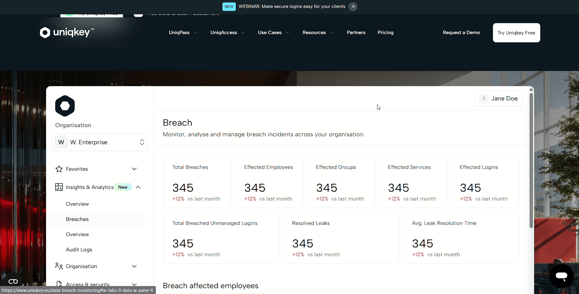
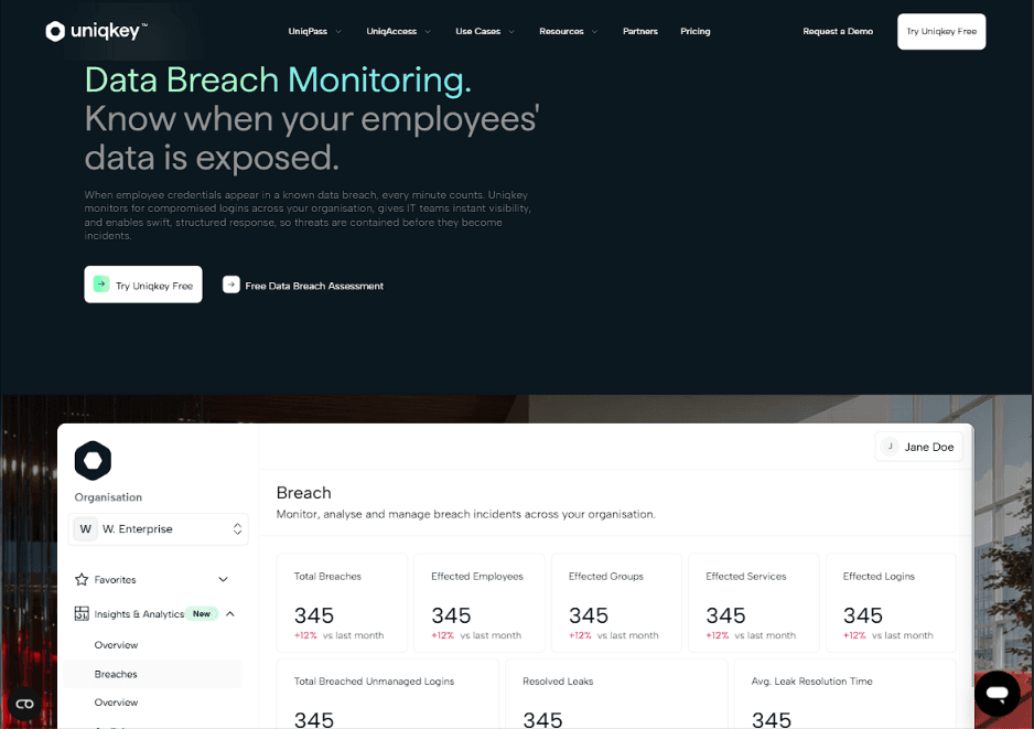
The hero didn't immediately explain why data breach monitoring matters.
Why this solution
Redesigned the hero around a stronger value proposition with supporting visuals and clear CTAs.
Why it works
Visitors immediately understand the problem and how Uniqkey solves it.
Problem
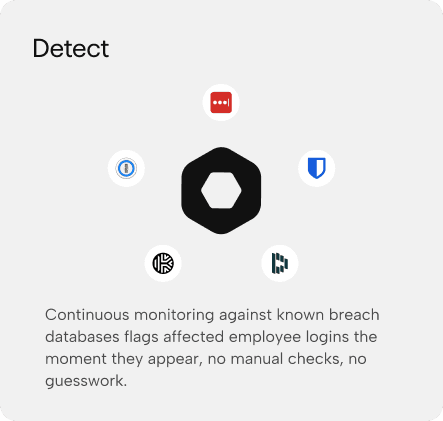
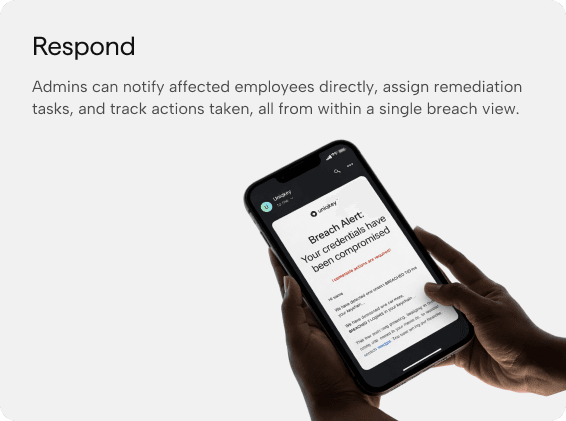
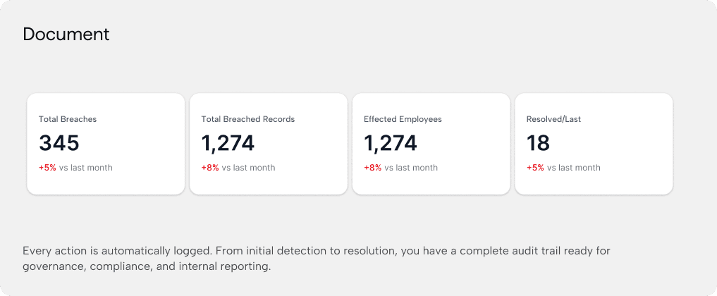
The impact of a data breach wasn't clearly communicated.
Solution
Introduced structured content and visual storytelling to explain the risks and their business impact.
Why it works
Creates urgency without overwhelming users.
Problem
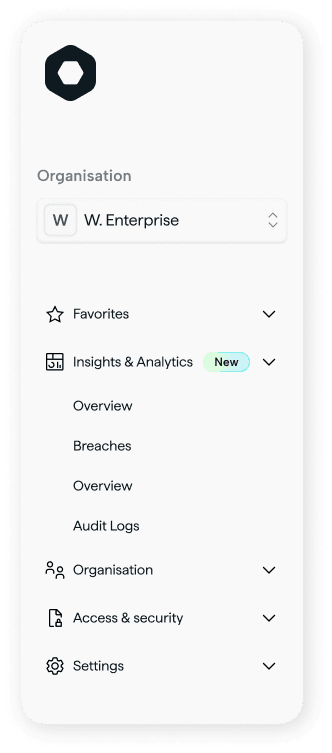
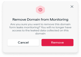
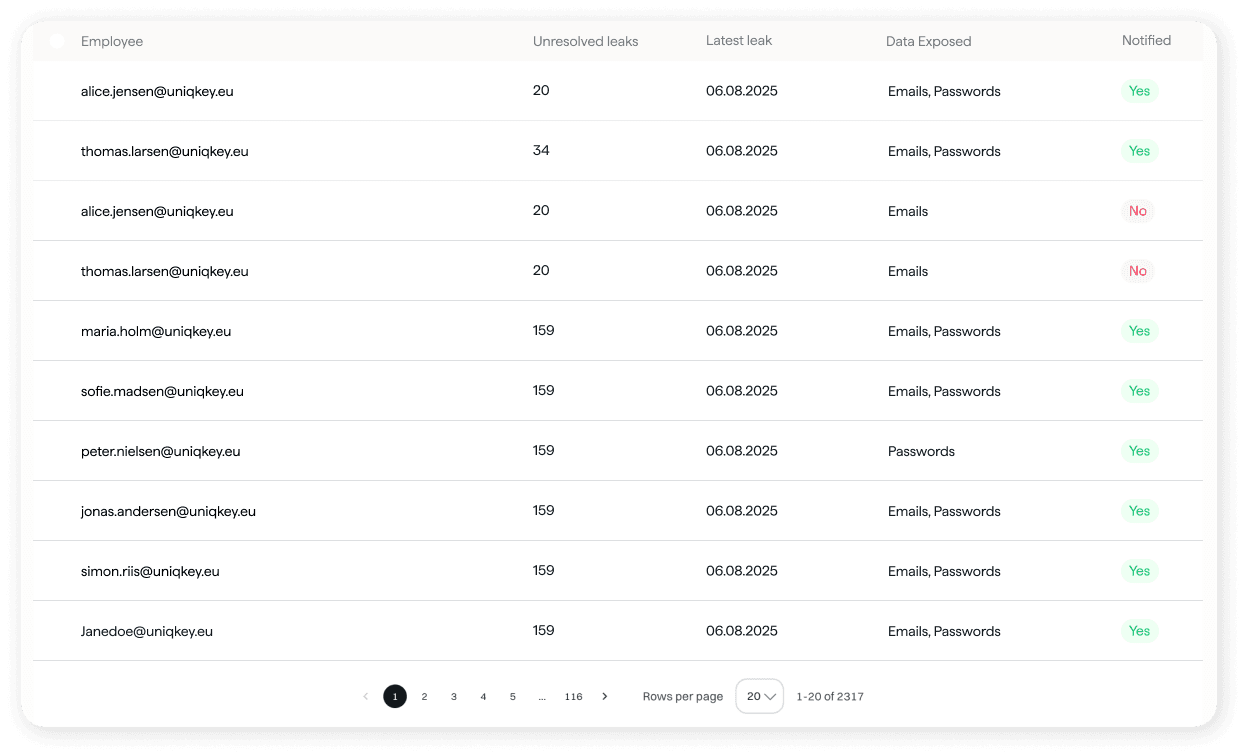
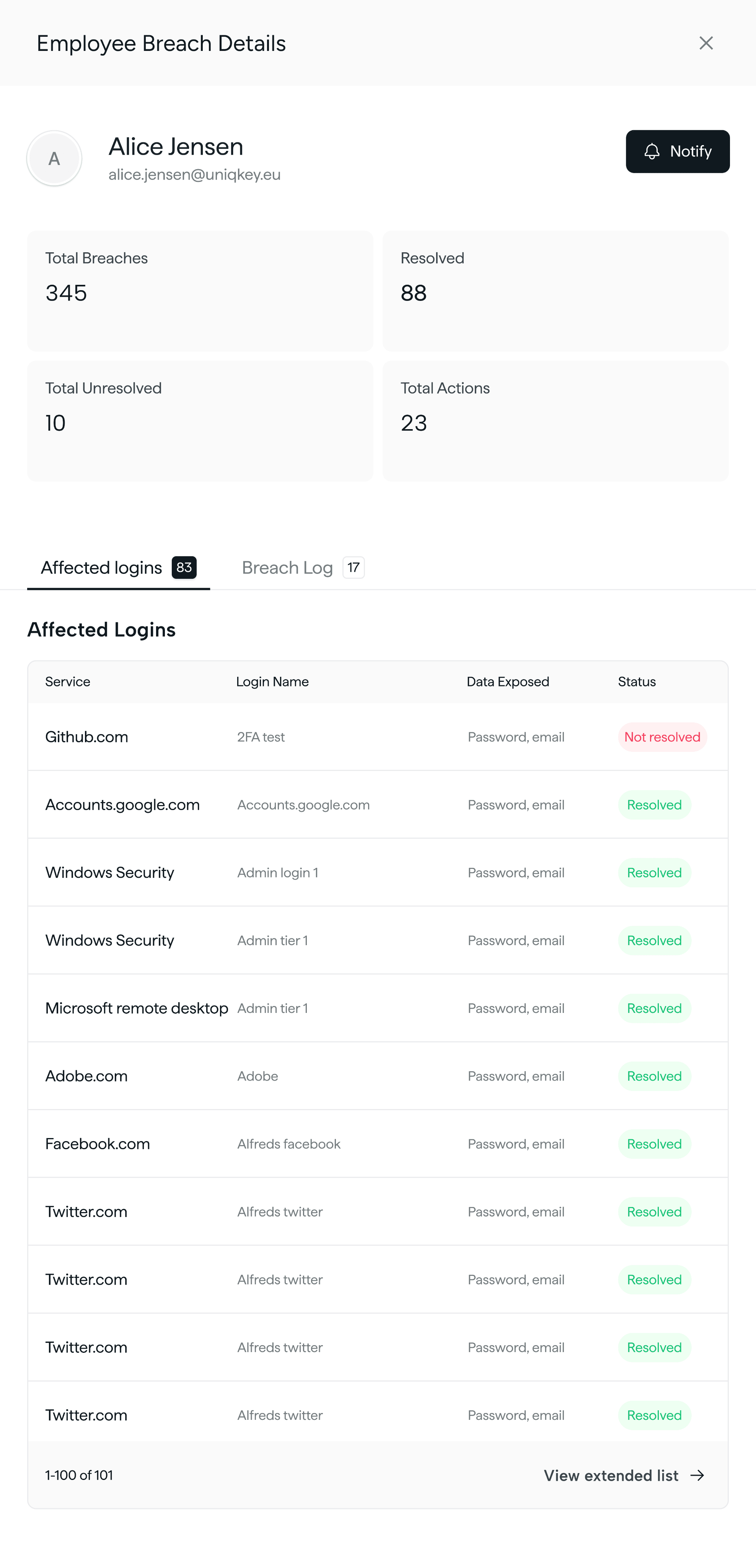
Core features were buried within large blocks of content.
Solution
Redesigned feature sections using modular cards, icons, and concise explanations.
Why it works
Makes capabilities easier to scan and compare.
Problem
The page lacked enough proof to reassure enterprise buyers.
Why it works
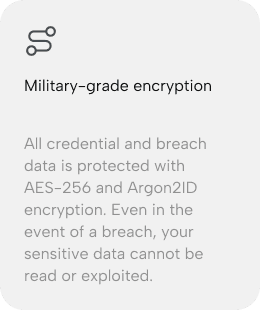
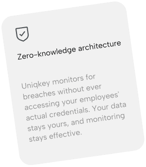
Added stronger trust signals through testimonials, certifications, and supporting visuals.
Impact
Builds confidence before users reach the CTA.
Outcomes
The redesign focused on creating a clearer, more structured experience that better communicates the product while making it easier for enterprise users to explore, understand, and take action.
Clearer Security Communication
↓ Complexity
Stronger Storytelling
1 Clear User Journey
Enterprise-ready Experience
↑ Brand Trust
Better Conversion Flow
↑ CTA Visibility
What I Learned
Designing for cybersecurity taught me that users don't need every technical detail upfront — they need clarity, confidence, and a clear understanding of why the product matters. This project strengthened my ability to simplify complex topics while designing experiences that educate, build trust, and encourage action.