Kodex
BASENINE, 2026
Redesigned Kodex's marketing site so a mature B2B compliance platform finally feels as trustworthy and easy to evaluate as the product actually is.
Overview
Kodex is a B2B compliance platform that helps organizations integrate regulatory workflows into their existing systems.
Redesigning the marketing website to better communicate the product, improve usability, and create a stronger enterprise-first experience.
The Challenge
The existing website didn't effectively communicate the value of the product. Technical information was difficult to digest, navigation lacked structure, and the overall experience didn't reflect the maturity of the platform.
Understanding the Existing Experience
After reviewing the existing website, I identified several areas that created friction for users.
Product messaging wasn't immediately clear.
Important content lacked visual hierarchy.
Navigation made exploration feel difficult.
Enterprise trust wasn't communicated effectively.
Visual consistency varied across pages.
Design Goals
After identifying the key pain points, I defined a few design goals that guided the entire redesign. The focus wasn't just on improving the UI, but on making the experience clearer, easier to navigate, and more aligned with how enterprise users explore and understand a product like Kodex.
Help visitors understand what Kodex does within the first few seconds.
Create a premium visual language that reflects the maturity of the platform.
Reduce friction and make important information easier to discover.
Design clear user journeys that naturally lead visitors toward booking a demo or exploring documentation.
The Redesign
The redesign focused on solving the most critical pain points uncovered during research.
Problem
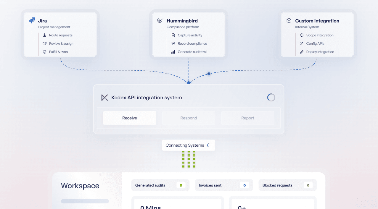
The hero section didn't clearly communicate Kodex's value proposition.
Why this solution
Redesigned the hero with stronger messaging, supporting visuals, and clear primary actions to immediately explain the platform.
Why it works
Visitors understand what Kodex does within seconds and know where to go next.
Problem
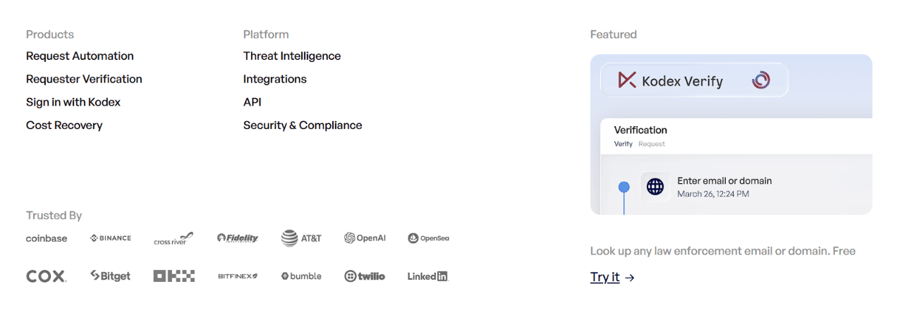
Users had difficulty discovering products, industries, and integrations due to an unstructured navigation system.
Solution
Reorganized the navigation around user intent and introduced a clearer information architecture.
Why it works
Makes exploring the platform more intuitive while reducing decision fatigue.
Problem
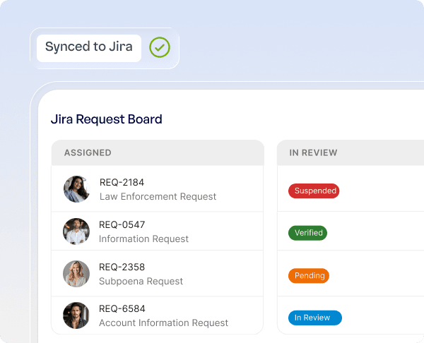
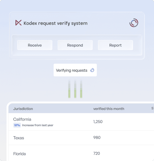
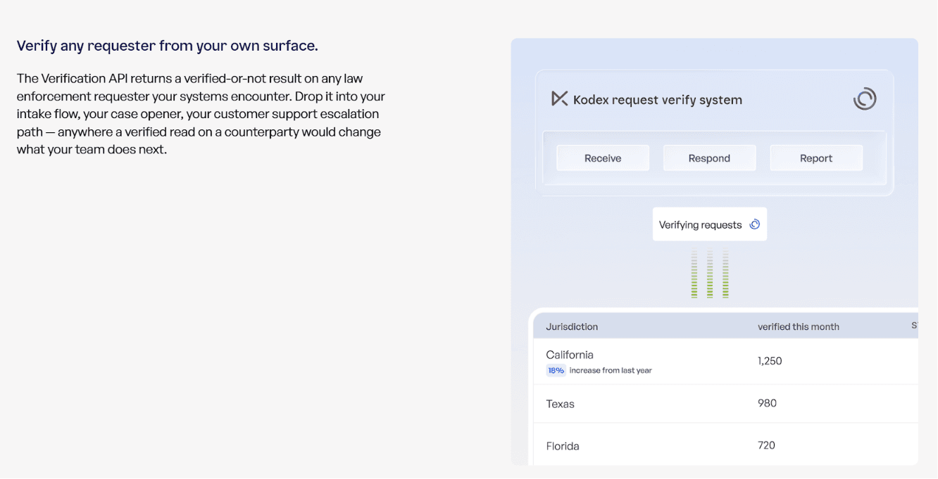
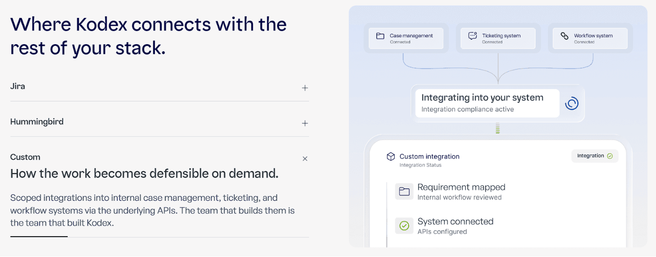
Complex compliance workflows were difficult to understand through text-heavy sections.
Solution
Rebuilt product pages using modular layouts, visual storytelling, and clearer content hierarchy.
Why it works
Transforms technical information into content that's easier to scan and understand.
Problem
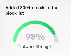
The website lacked visual elements that reinforced credibility and trust.
Why it works
Introduced stronger typography, consistent spacing, customer logos, supporting visuals, and enterprise-focused layouts.



Impact
Creates a more credible and professional experience for enterprise buyers.
Outcomes
The redesign transformed Kodex's website into a clearer, more structured experience that better communicates the product while reinforcing trust with enterprise customers.
Clearer Product Communication
↓ Learning Curve
Improved Navigation
3 → 1 Navigation Path
Stronger Enterprise Trust
↑ Brand Trust
Conversion-Focused Journey
↑ CTA Visibility
What I Learned
Working on Kodex taught me that designing for B2B products goes beyond creating clean interfaces — it's about simplifying complex ideas and communicating them with clarity. I also learned how to balance stakeholder feedback, business goals, and technical constraints while building a scalable experience that feels intuitive, trustworthy, and ready to grow.