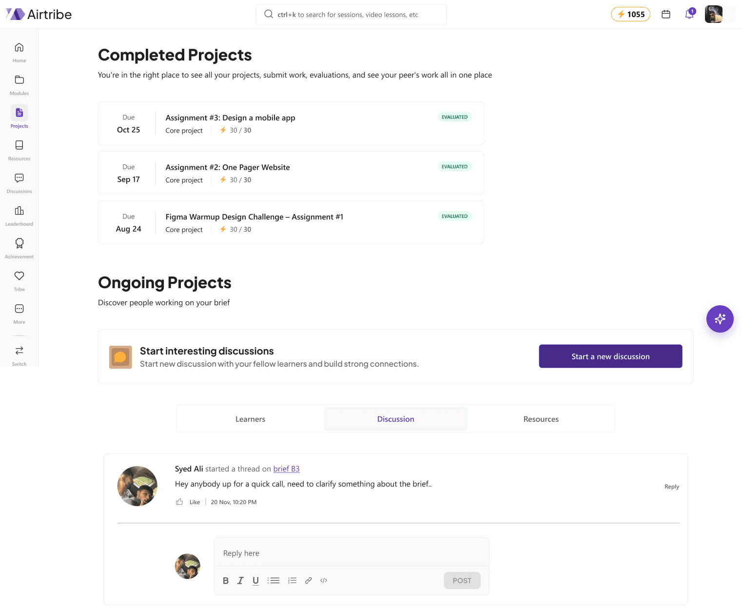
Airtribe - AI Learning Experience
EduTech, 2026
Designed an AI experience for the users to ease their learning experience through out the site.
Overview
An AI-powered redesign of Airtribe's learning platform focused on helping learners navigate courses more confidently, reduce friction, and receive contextual AI assistance throughout their learning journey.
Airtribe is a cohort-based edtech platform where professionals learn through live sessions, mentorship, assignments, and community-driven programs.
The Challenge
Although Airtribe offered quality learning content, the overall experience made it difficult for learners to understand where they were, what to do next, and how to make the most of the platform.
My goal was to redesign the learning experience while exploring how AI could provide contextual assistance without overwhelming users.
Breaking Down the Problem
To dig deeper, I broke the problem down into four areas: how learners moved through their course journey, how they navigated the platform, how information was prioritized, and how engaged they felt along the way.
Each area became its own lens for uncovering exactly where the friction was coming from.
Learning Journey
- Users struggled to understand the overall course flow.
- Progress wasn't clearly communicated.
Navigation
- Finding recordings, assignments, and resources required unnecessary effort.
- Core sections felt disconnected.
Information Hierarchy
- Important actions competed for attention.
- Users had difficulty identifying priorities.
Engagement
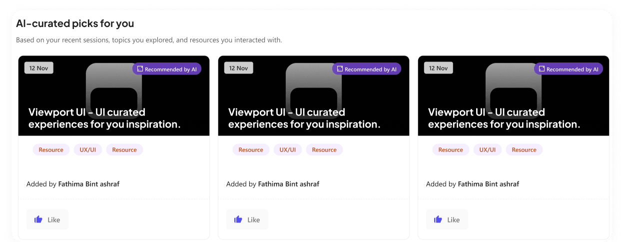
- The platform lacked proactive guidance.
- Learners often had to search for information instead of receiving timely support.
Research & Findings
After reviewing the existing platform, studying the user journey, and comparing similar learning platforms, I found that most friction didn't come from the content itself — it came from how learners interacted with the platform.
Users weren't looking for more features. They wanted a learning experience that felt structured, guided, and easy to navigate.
The research highlighted four recurring themes that became the foundation of the redesign.
Learning Flow
- “Not sure where to start.”
- “The course journey feels confusing.”
- “I don't know what's coming next.”
Navigation
- “Finding recordings takes too many clicks.”
- “I keep jumping between different sections.”
- “Assignments and resources feel disconnected.”
Info. Hierarchy
- “Everything feels the same.”
- “Not sure what to do.”
- “Easy to miss updates.”
AI
- “Need instant answers.”
- “Resources are hard to find.”
- “Need tailored recommendations.”
Insights
The research uncovered recurring patterns in user behavior that revealed where learners experienced the most friction. These insights guided the redesign and shaped every feature that followed.
Learning should feel effortless. Surface only what's relevant instead of making learners process everything at once.
Instead of presenting every resource upfront, provide contextual guidance and clear next steps based on where the learner is in their journey.
Learners shouldn't have to remember where information lives. Answers should appear within the context of the task they're already doing.
AI is most valuable when it supports mentors and learners with summaries, recommendations, and guidance — not when it attempts to replace human teaching.
Solutions
The redesign focused on solving the most critical pain points uncovered during research.
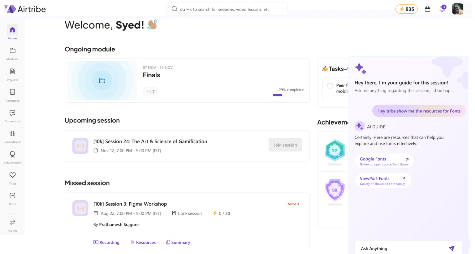
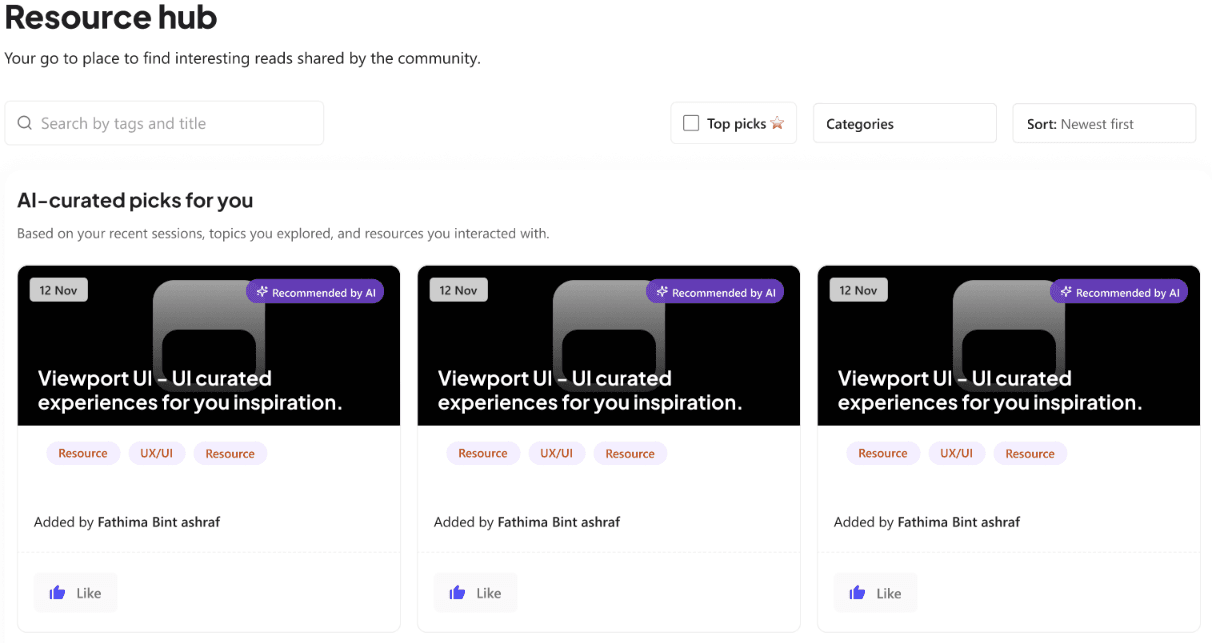
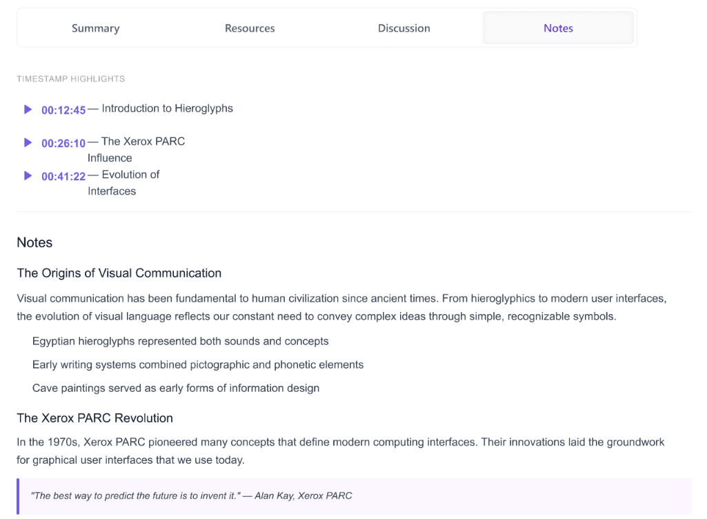
Problem
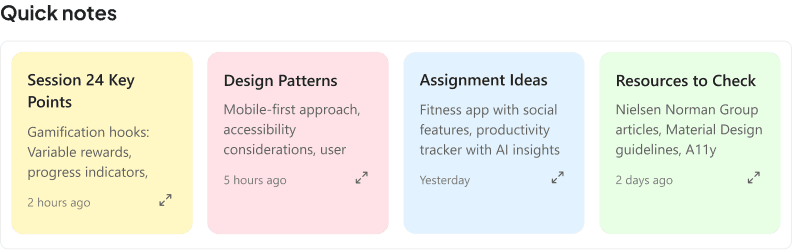
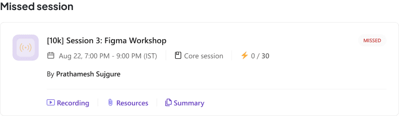
Learners spent too much time searching for answers across recordings, discussions, and resources.
Why this solution
Redesigned the hero around a stronger value proposition with supporting visuals and clear CTAs.
Impact
Faster access to information, reduced friction, and a more guided learning experience.
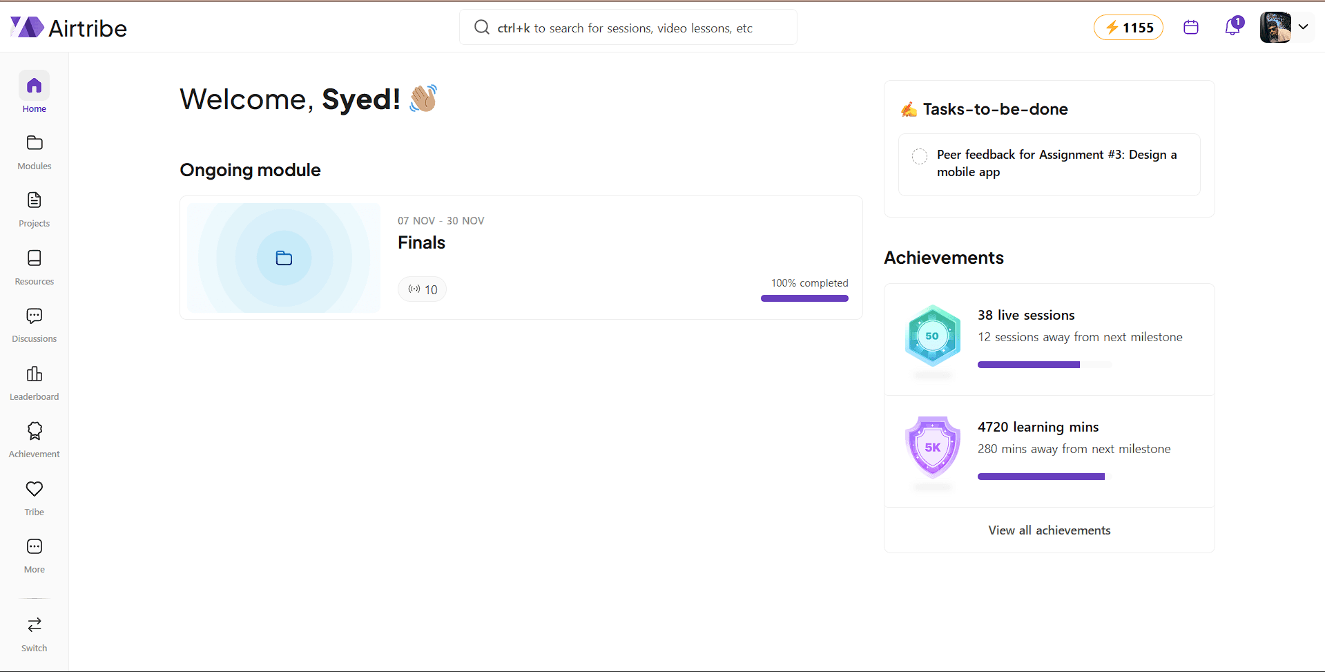
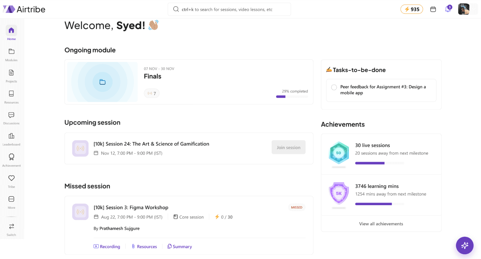
Problem
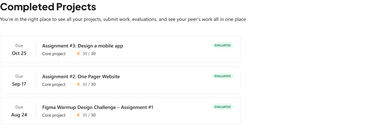
Users couldn't quickly understand their progress or what required attention.
Solution
Highlights priorities, upcoming sessions, and progress in a single, easy-to-scan view.
Why it works
Learners can see exactly what needs attention at a glance, without digging through multiple screens.
Problem
Finding recordings, assignments, and resources required unnecessary effort.
Solution
Users can reach core sections faster with a more predictable navigation experience.
Problem
Important information competed equally for attention.
Why it works
Reorganized content using stronger hierarchy, spacing, and visual emphasis.
Impact
Users can identify priorities at a glance and make decisions more confidently.
Outcomes
The redesign focused on creating a clearer and more guided learning experience by simplifying navigation, improving information hierarchy, and introducing contextual AI support.
Clear Learning Journey
↓ Cognitive Load (Qualitative)
Faster Navigation
3 → 1 Clicks
Contextual AI Support
24/7 Assistance
Better Information Hierarchy
↑ Task Visibility
What I Learned
This project helped me think beyond just designing screens. I learned how small UX decisions can shape the entire learning experience and how AI should solve real user problems instead of being added just because it's trending.